Updated · July 2026
ATS-tested
Guide
ATS-Friendly Fonts That Still Look Human.
Which fonts pass ATS parsers in 2026, which to avoid, and how to keep a resume readable for recruiters.
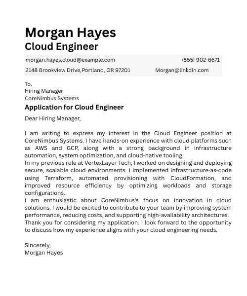
Parser safety comes from standard glyphs and clear hierarchy - not from neon Canva display fonts.
Parser-safe layouts
Free resume score
No subscription required
Guide
Practical steps you can apply today.
Use these checks before you submit. Each one is written to survive ATS parsers and human skim-reading.
01
Which fonts pass ATS in 2026?
Prefer fonts that map cleanly to Unicode and survive PDF export.
- Calibri, Arial, Helvetica, Georgia, Times New Roman
- Garamond is usually fine if glyphs stay text, not outlines
- Skip decorative scripts, handwriting packs, and icon fonts in body copy
02
Size, weight, and hierarchy
ATS cares less about brand fonts than about readable structure.
- 10-12pt body, 14-16pt section heads
- One family + one emphasis style beats five mixed fonts
- Keep bold for labels; do not bold entire paragraphs
03
Export without breaking glyphs
A safe font still fails if export flattens text into images.
- Prefer parser-safe templates over designed posters
- Test PDF text selection after export
- NeuraCV keeps glyph text selectable in ATS templates
Template gallery
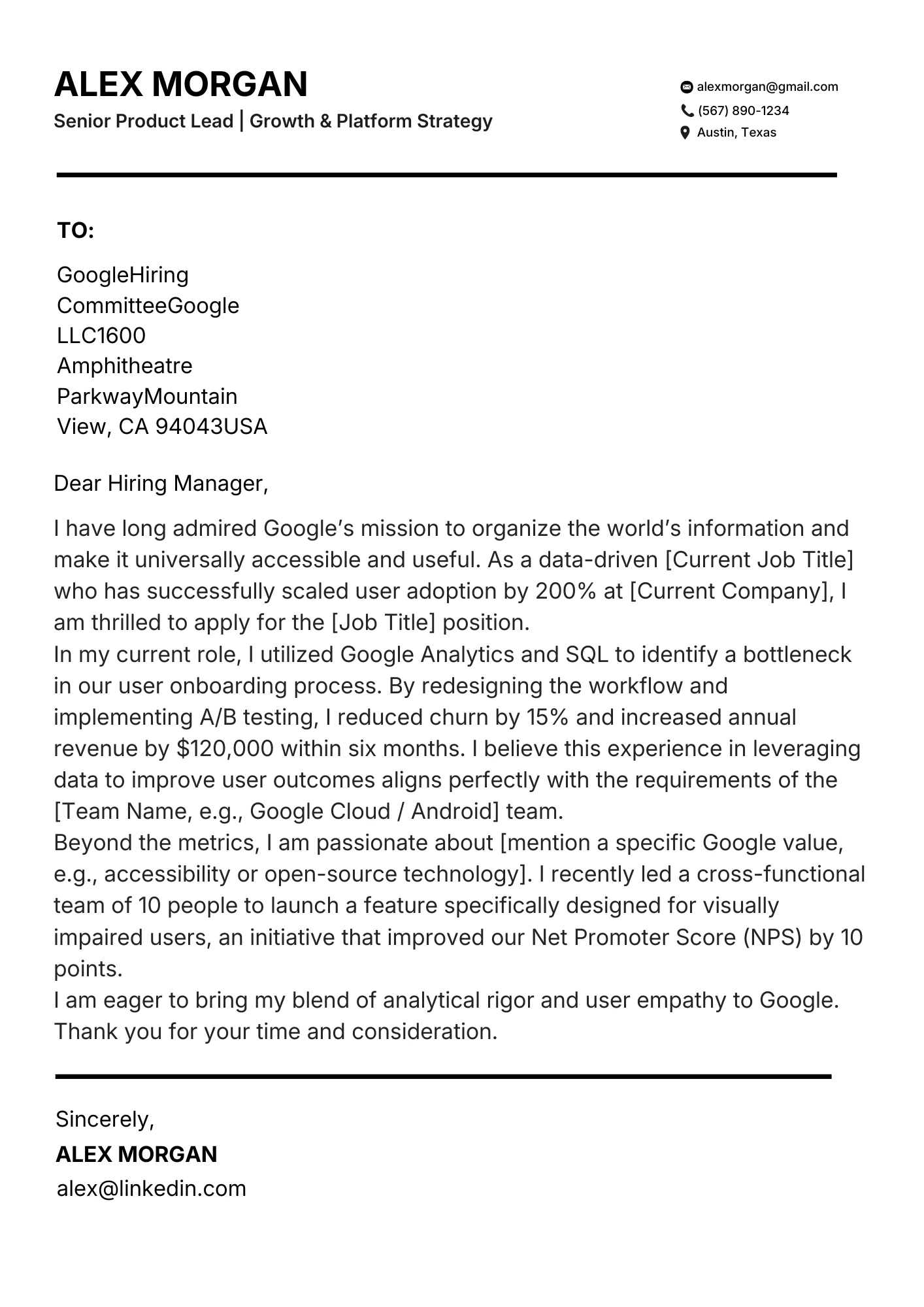
ATS templates you can start from today.
Pick a parser-safe layout, then tailor keywords for your target role.
Ready to apply what you just read?
Build a resume on a parser-safe template with fonts that survive ATS and still look sharp to recruiters.
FAQ
Quick answers
Are serif fonts bad for ATS?
No. Readable serifs like Georgia usually parse fine. Avoid script fonts.
What font size should I use?
Most ATS-safe resumes use 10-12pt body text.
Should I embed custom fonts?
Only if export flattens glyphs. Common professional fonts are safer.
Does Canva styling hurt ATS?
Heavy text boxes and columns hurt more than basic font choice.
