Elevate your CV design without losing readability.
White space, typography hierarchy, colour accents and accessible contrast - built to guide a recruiter's eye in six seconds and parse cleanly in Workday, Greenhouse, Taleo and NHS Jobs.
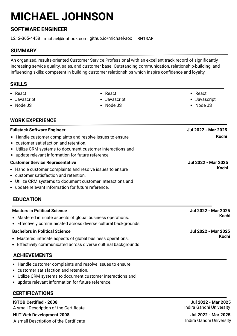
Six ATS-friendly layouts, designed to read well.
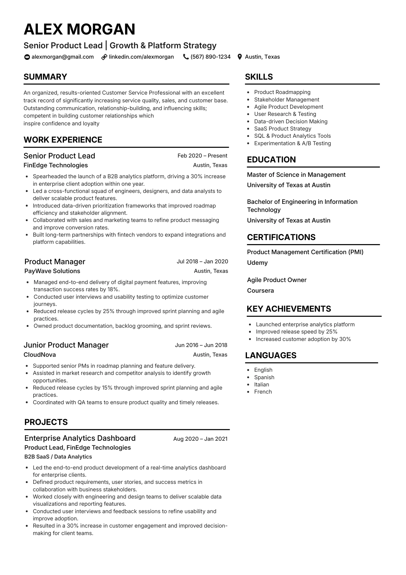
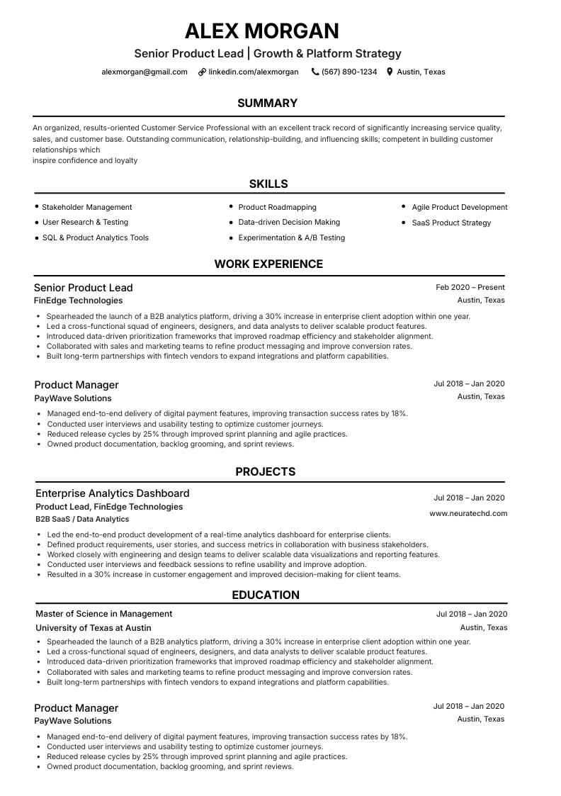
Every thumbnail below is a real NeuraCV layout, not a mock-up. Each one applies the white-space, typography and accent-colour rules from this guide. Click any template to open it in the editor.
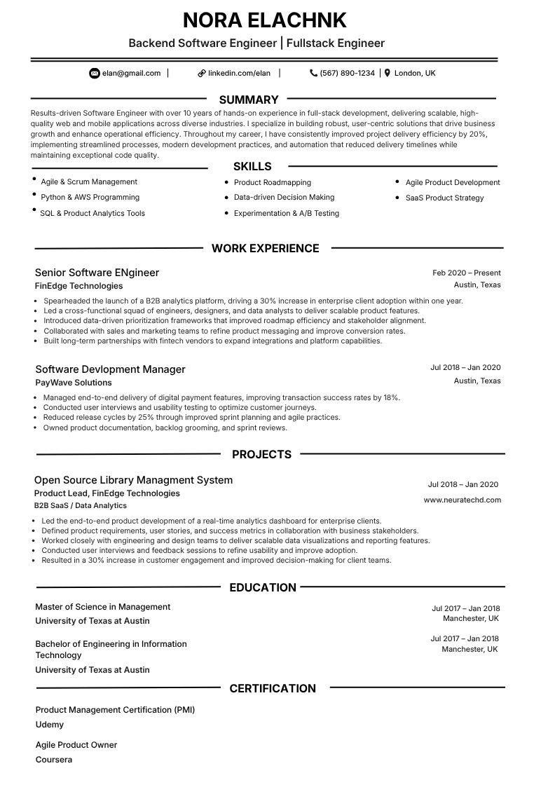
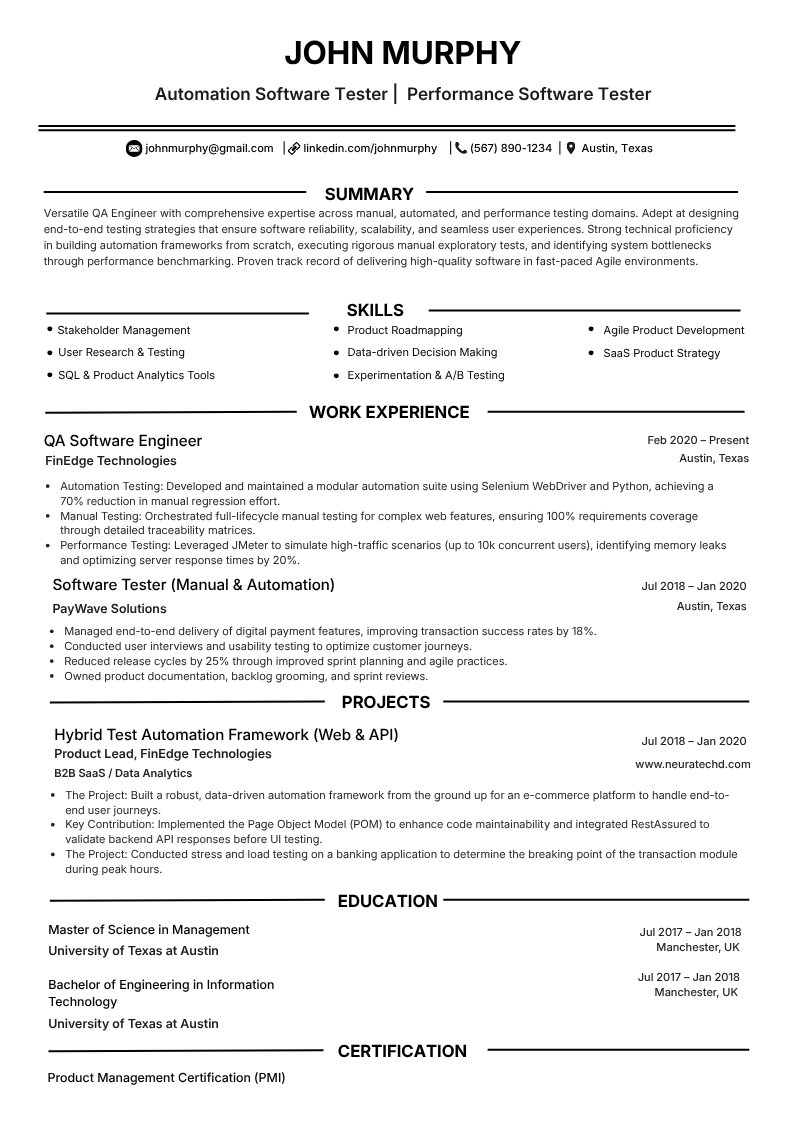
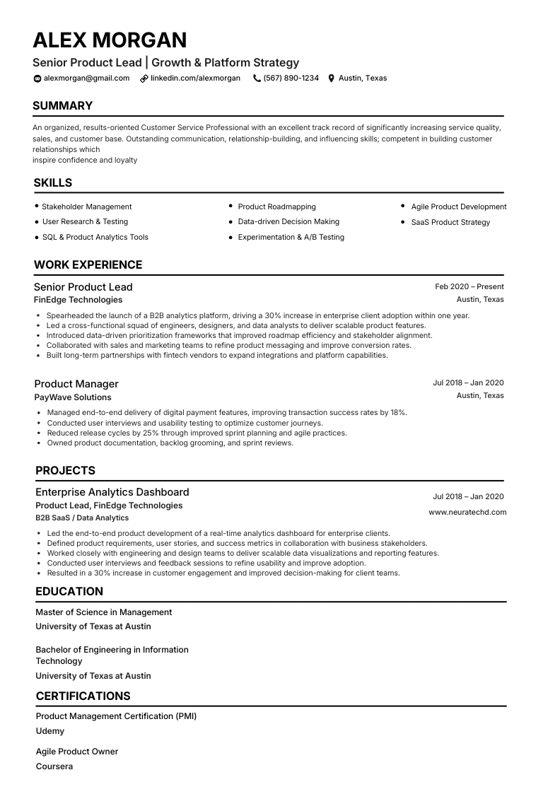
The only ATS-first CV builder with no subscription traps.
Canva, ChatGPT drafts and generic builders create hidden parsing problems even when the design looks polished. NeuraCV is built from the ground up for applicant tracking systems, with a one-time payment and lifetime access.
| NeuraCV | Canva | ChatGPT draft | Other AI builders | |
|---|---|---|---|---|
| Guaranteed ATS parsing | ✓ | ✗ | ✗ | Partial |
| No recurring subscription | ✓ One-time | $12.99/mo | $20/mo | $9 - 24/mo |
| Role-specific keywords | ✓ | ✗ | Manual | Partial |
| Free ATS score checker | ✓ | ✗ | ✗ | Paywalled |
| PDF + DOCX (no watermark) | ✓ | Paid only | Manual | Watermarked |
| UK / NHS format variant | ✓ | ✗ | ✗ | ✗ |
Pick the design area that needs the most work.
Every good CV gets the same six fundamentals right. Start with the one you know is weakest and the rest becomes easier.
Early career / Graduate
One page. Lead with skills, projects and education. Generous white space so a tight experience section does not feel sparse.
Mid-career (3 - 7 yrs)
One dominant column with quantified outcomes. Section headings slightly larger than body, job titles bolder than dates.
Senior (8 - 15 yrs)
Two pages allowed. Top third shows the leadership story. Muted accent colour on section rules. Wider line-height for scannability.
Executive / Director
Confident, minimal layout. Serif or premium sans heading, generous margins, board-ready metrics. Quiet design that lets outcomes speak.
Design a CV that looks sharp and parses in four steps.
Set a parser-safe base
Single column, standard headings (Summary, Experience, Education, Skills), selectable text, no tables or text boxes.
Build type hierarchy
One or two clean sans-serifs. Name largest, sections next, body 10.5 - 11.5pt with 1.3 - 1.5 line-height.
Add one restrained accent
One muted accent for section rules or headings. Test in greyscale. Never rely on colour alone for meaning.
Validate before sending
Paste the export into a plain-text editor, then run the PDF through NeuraCV's free ATS checker to confirm the parse.
The rules recruiters and ATS both respect.
Three clusters that cover every design decision on a CV. Treat each one as a checklist before you export.
Typography & hierarchy
- Inter, Calibri, Arial or Roboto sans-serif
- Name 18 - 24pt, sections 12 - 14pt bold
- Body text 10.5 - 11.5pt for print
- Line-height 1.3 - 1.5 of the font size
- Two typefaces maximum across the page
- No skill bars, stars or icon ratings
Layout & structure
- Single column or parser-safe two-column
- Margins at least 1.5 cm on all sides
- Top third earns its space (summary or recent role)
- Dates flush right, consistent pattern
- Uniform bullet indentation throughout
- Modular sections you can reorder
Colour & accessibility
- One muted accent colour, used sparingly
- Dark text on light background (4.5:1 min)
- Tested legible in greyscale print
- Logical heading order for screen readers
- Selectable text, never flattened images
- Clean file name: Firstname-Lastname-CV.pdf
Design, parse and export in under three minutes.
Free. No credit card. ATS-tested across Workday, Greenhouse, Taleo, iCIMS and NHS Jobs.
Answers for anyone designing a CV in 2026.
More NeuraCV guides for your next application.
Pair this design guide with companion reads on ATS scoring, templates and bullet writing from the NeuraCV editorial team.
